
July 28, 2021
Website Effectiveness: Home Sweet Home
 Websites are pretty much a given when it comes to providing customers with general information regarding your markets. But does your home page provide the maximum benefits to help grow your weekly number of shoppers at your farmers’ market?
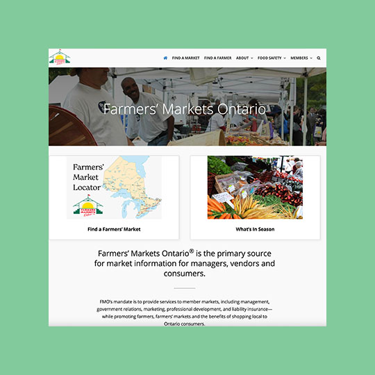
Most farmers’ markets have a website. But let’s concentrate on the home page. This is really the welcome mat and the first thing that makes an impression on not only your regular customers, but also of your perspective customers.
It is incredibly worthwhile to ensure that your homepage’s design is as welcoming and engaging as possible. A strong homepage design can attract and entice website visitors to explore your products and services and even make an order.businesstobusinesscommunity.com
Just like your car or maybe your toaster, it’s important from time to time to pay it some attention and provide a little TLC to make sure you are getting the most out of your trusty contraption. Websites and specifically home pages, are no different. So here’s a list of a few homepage elements that you should give some thought and attention to.
(Based on information from hubspot.com and globalreach.com)
Logo
Your market logo should be visible at the top of your page (and on every page) as it is an integral part of your brand and is a key piece for clients to recognize and connect with your brand.
Headline
All websites need to tell visitors what the site is about and has to offer. A headline with sub-head or paragraph text should provide a clear description of your business and what you do or the services you provide. This is usually 2-3 sentences of clear and concise text targeted to your audience. No need for fancy terms and big words. Keep it simple! This information is a key element to help increase your search rankings based on information collected by automated internet robots used by search engines like Google.
Location and Hours of Operation
I know many of you are probably saying we already have a web page with a map and our location so why duplicate it on the home page? While your regular customers know where you are, for people new to the market or for people visiting the area , they want to know key information with the least amount of effort. When you factor in that most potential new customers and visitors are viewing your website on their phone, they should be able to find the 5 key descriptors of your operation – who – what – where – when – why – with a flick of a thumb!
Data Collection Button/Link
Collecting leads for a mail list is a key element to marketing success. As discussed in the July 14 edition, both Mailchimp (a free service) and Constant Contact provide easy to use button creation to add to your website to collect leads to build a mailing list. Use a description like: Keep up-to-date on Market happenings! This button should live on the home page and as many other pages as possible.
Footer
The footer is the bottom section of your website. Even though it is located at the bottom, an informational footer is arguably as important as your header navigation. Once your visitor reaches the end of your homepage, this area should provide three features: contact information, links to other important pages, and social media links. Contact information encourages the visitor to get in contact with you. Links can be a helpful way to encourage the user to check out interior pages. Providing links to social media channels is a great way to encourage visitors to engage with your company on another medium. It also provides another method of connection and communication to your regular and perspective customers.
Be Mobile Friendly
Over the fast few years, the trend to viewing websites has moved from desktops to mobile devices. Since the start of the pandemic, mobile users share has increased by over 10%. Currently, over 51% of people in North America views websites on their phones. If you have never viewed your market’s website on a mobile device, then take a minute and do it. If your website is not built to be responsive, it will look very tiny on your phone. Make sure the key information displays near the top. Have a good look of your home page copy. Two paragraphs on a desktop view vs. two paragraphs on your phone are two very different beasts. Don’t forget, most phone users will only scroll with their thumbs for a limited amount of time. As mobile usage will only increase over the coming years, your home page and website should be designed for mobile first.
One Last Thing to Remember!
A successful website does three things: It attracts the right kinds of visitors; Guides them to the main services or product you offer; Collects contact details for future ongoing relations.Mohamed Saad